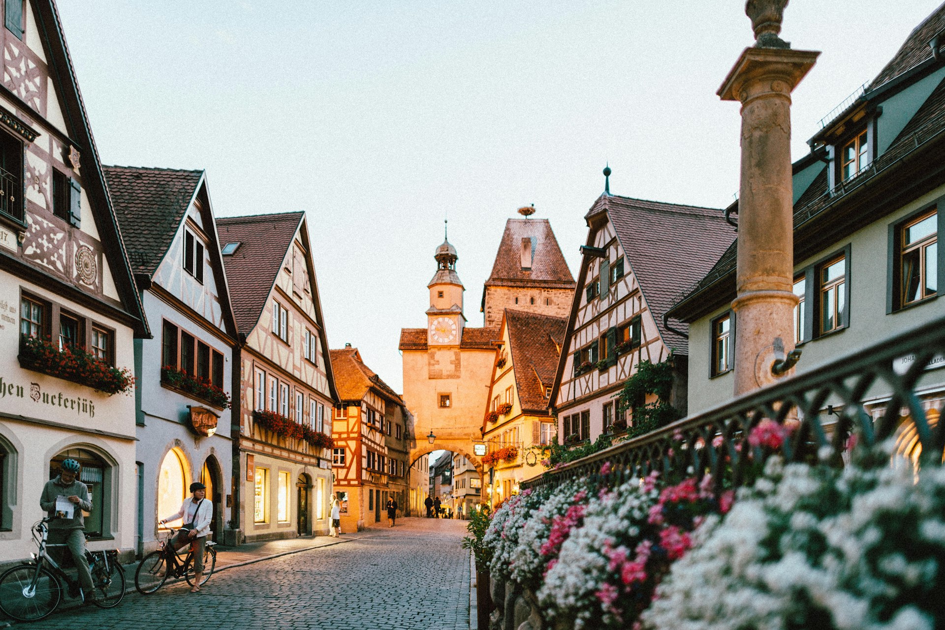
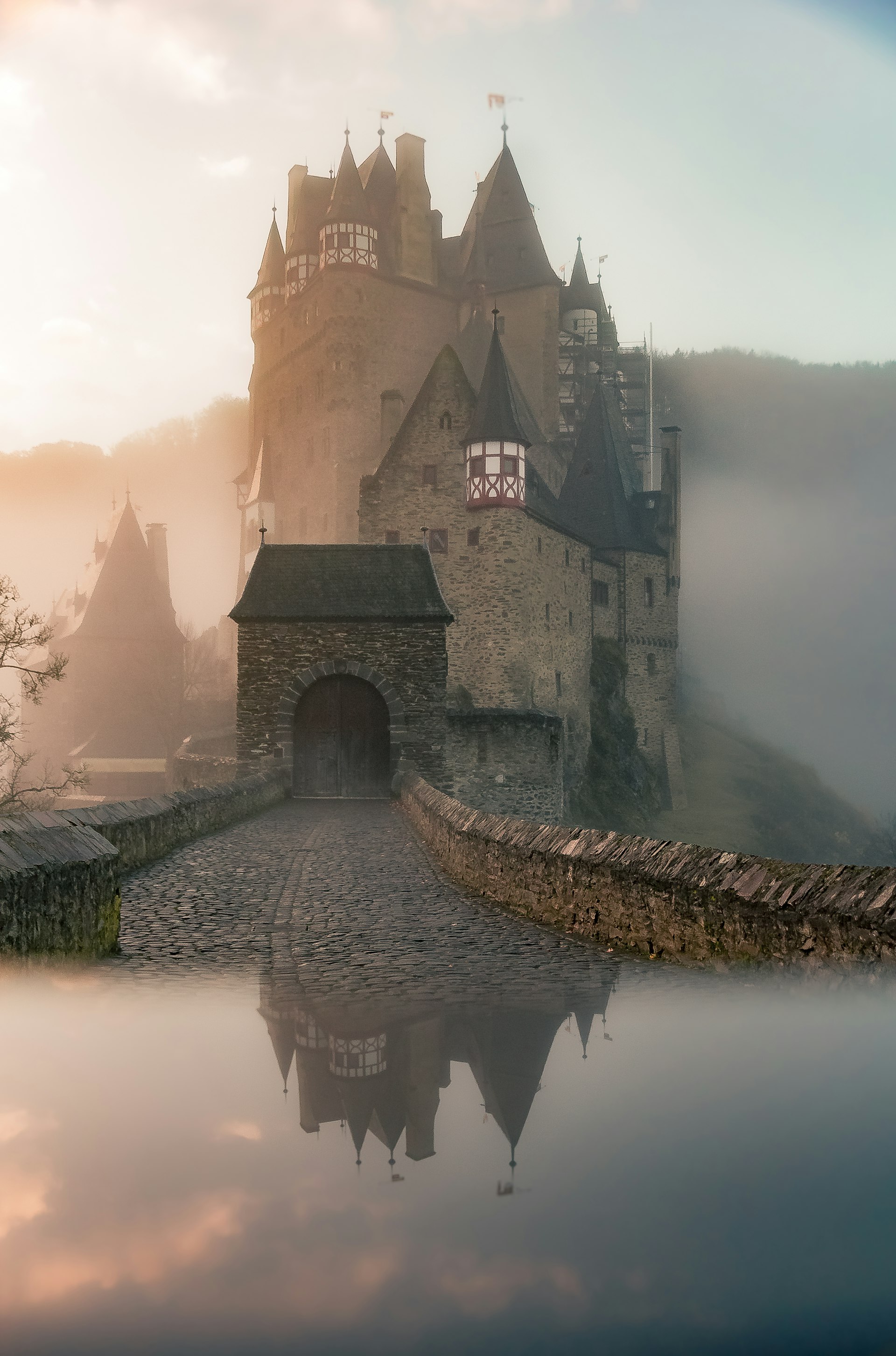


Autumn has arrived!

Bring Autumn Into Your Project
More than 65 Angular components with the colors of a German autumn. Install with the CLI, get the code in your project and change whatever you want.
Get started
Ready in minutes, not days.
One CLI command copies a component into your project. The code is yours, already typed, accessible and using the theme.
Live components
Every component, live on the page.
A sample of the library to try right here: click, toggle and type. The examples run the real code, and the docs have every detail.
import { HbTabsImports } from '@herbst/ui'
hbValue · hbSize · hbFluid
Inputs: hbValue · Outputs: hbChange
view · grid
page · 2 / 7
Theming
Paper by day, Dusk by night.
Every color and size lives in one file, theme.css, as oklch CSS variables on Tailwind v4. Change a value and every component follows, in light and dark mode.
--background
--foreground
--card
--primary
--secondary
--muted
--accent
--border
--ring
--destructive
--success
--warning
Build
Build interfaces with little code.
Import the component, add the selector to your template and you are done. Typed inputs, signals and accessibility come built in. The code on the side renders exactly what you see below it.
Open source
Build Herbst UI with us.
Herbst UI is open source. Open an issue, contribute a component or star the repository to follow the updates.